Why Outfits Matter for Family Photos
When it comes to what to wear for fall family photos, clothing can make or break your photos- it impacts the aesthetic, the mood, the focal point of the image, and the time it takes to edit. Your color palette can make your family completely disconnected from the background and each other. If you are wearing neons mixed with muted colors, it can actually make your eye react in a way that makes you want to look away from the photo. It can be overwhelming, overstimulating, and look messy.
Colors can also make you disappear into the background- like shooting green clothing when the background is tree lined.
Patterns and labels can be distracting. Fabrics can even play a role in how put together your photo looks. If someone is wearing a winter fabric (cream knit) vs a summer fabric (white linen). Or a spring pink vs a winter pink. There’s a lot to think about!
Men, try a button down or a sweater instead of a polo/golf shirt. You can instantly uplevel your photo with that choice.
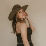
If you want warm, inviting, cozy, timeless images, it is best to stick to neutrals and earth tones (no blue) with various textures for a cohesive and aesthetic gallery.

Women’s Stripe Dress | Mens Sweater | Mens Brown Pants | Mens Shoes | Girls 3m-5T Sweater | Girls 1.5-6YR Brown Pants | 12m-5T Boys Plaid Flannel | 2yr- 16yr Boys Stretch Jean

Girls 1.5-6YR Muted Red Border Dress | 1.5-6YR Boys Maroon Stripe Sweater | 3.5-10YR boys Camel Houndstooth Pants | Women’s Dark Red Dress | Mens Brown Knit Sweater | Greige Mens Jeans | Mens Shoes

Womens Floral Dress | 6m-4T Girls Red Dress | 2yr-10Yr Boys Brown Checkered Shirt | 2yr-10yr Boys Slim Fit Brown Jeans | Mens Henley |
Woman’s White Sweater | Red Pleated Maxi Skirt |
My Favorite Color Palettes That Always Photograph Beautifully
My favorite color palette for fall family photos, will always be neutrals (cream/brown/ tan) for every season.. I love muted earth tones (blush, khaki, rust, maroon, red, mustard) as a secondary color. And I hate blue.
I love the photos that show warmth and focus on connection rather than distracting colors, so I tend to take out greens/ blues/ yellows to give more of that gold/brown/ vintage feel.. so wearing these colors can make photos look gray.
Your outfits cast colors on skin, and i’d rather have a brown or cream reflecting on my skin rather than a green/ blue/ or yellow.. those colors can make you look sick.
Colors to avoid: Cool tones like Navy/dark blue, overly bright/neon shades, purple, black, and pastels (for me– every photographer has a different aesthetic)
Even if your whole family is wearing light colors and one person wears dark blue denim, your eye will see the blue denim and cool down the whole image. If you want to wear denim, I suggest a lighter style and not a skinny jean.


The truth about black.
Black shows power, mystery and sophistication, which isn’t really a mood i’m trying to capture. It also absorbs the light and creates deep shadows and less detail in fabric or movement. It weighs down the image, making your eye go to the heaviness of the black. I know black is slimming, but so is flowy and dressing for your body type. Black shows dust and because I decrease the contrast in my photos, it leaves blacks looking more gray. Yes, I can bring the contrast back, but it will add a whole other look making the black stand out more and take away from the dreamy feel.
The truth about Blue.
The mood blue can evoke- sad, calm, peaceful, and while this color may work great for some photographers, it distracts from the feel i’m going for with my images. There are not many sessions I photograph with littles that are sad, calm, or peaceful… I feel like this color is lying to the viewer lol or maybe just not authentic- which is something I want to capture more of in my photos.
Cool tones absorb the warmth from the scene. It can clash with my golden tones and earthy background. Blue flattens the warmth in skin tones and removes the cozy/inviting aesthetic I’m going for as a storytelling photographer.
Coordinating Without Matching
What to wear for fall family photos includes coordinating but not matching. Avoid everyone wearing the same shade. Not everyone should show up in jeans and a white shirt. Vary the khaki pants with different shades. If someone is wearing khaki on the bottom, someone else could be wearing a khaki color on the top. Textures can also separate the same color- maybe go with a camel houndstooth pant and a brown jean.
You can check out more of What to Wear and What not to Wear for Family Photos HERE.
Need Personalized Styling Help?
I offer a pinterest board of inspo along with my amazon store to every client. For my story sessions, I send clients a shoppable style guide through Style & Select with customized options and links for each family member. This can give them a visual and gets us both on the same page.
I’ve now made it available as an add-on to any session.